Whether you were trained on an electric typewriter or more current keyboard classes, there are definite differences in what you were taught in school and what works for page layout in books.
Did you learn the home-row keys in school? Can you say them in order without moving your fingers to remember which key is where? Those who type with two fingers may not understand what home-row keys are, but for those that do, let’s take a closer look and undo a few concepts.
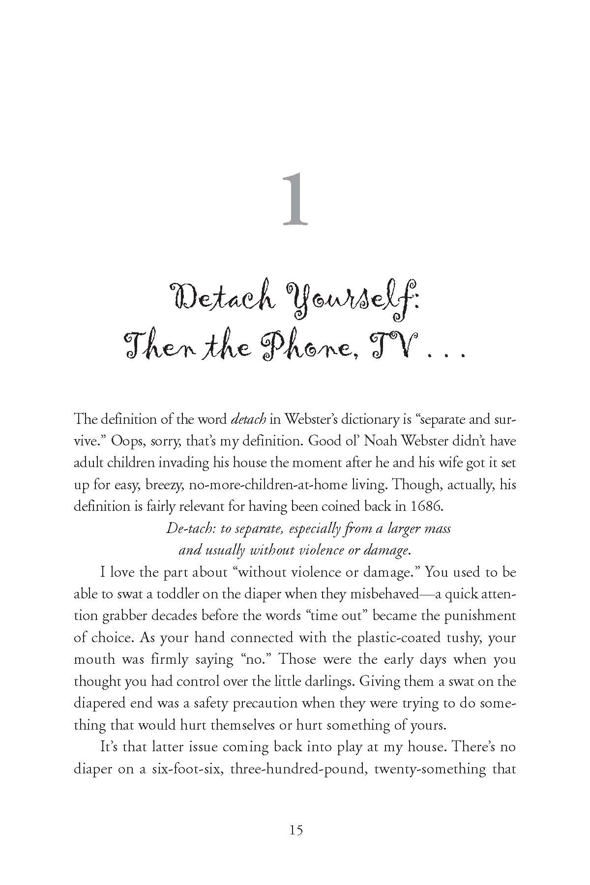
Design layout for a business letter is not the best layout for a book. Business letters, school reports and other documents you produced while learning to type were set up for easy, quick reading in short amounts of time. A book, on the other hand, is multiple chapters of information and a professional looking page layout has been designed from research over the years to be easy on the eyes of the reader, where hours could be spent reading umpteen pages with the least amount of strain.
In the world of self publishing, you want your book to be of high standards as it has to compete with traditionally published books and the growing population of new self published authors. Many writers feel they can design their own book after finishing the manuscript and save money by doing it themselves, right? Warning: Nothing stands out, or screams amateur more than pages of a book set up like a business letter, blog or how you were taught in typing class.
When a possible buyer flips through your book, the pages should look professional, book-industry standard. Sadly, many self published books do not keeping a negative vibe over the process and you may lose sales because of it. Open a similar genre book in the library or local bookstore. Nothing should pop out or immediately draw attention away from the information or story.
Most common mistakes found are:
- Using Times New Roman for the text. There are a dozen serif fonts you can use which will enhance the readability of your book. The TNR font was originally created for newspaper print, columns of text. Trying to read a novel in Times New Roman is tough and tiring on the eyes. It can be used in a double-spaced manuscript for an agent or publisher review. The double-spaced lines and wide one-inch margins will compensate for the font. Just because it is typically the default font in your Word program is no reason to use it for book layout.
- Extra spacing between paragraphs. When reading a novel or memoir there should be no additional break between paragraphs unless there is a scene break or change in the point of view. When your eyes see the extra divide, they will pause and alert something different is coming. If you layout your text with double-spacing it is more difficult for your reader to stay with the flow of the story. Subconsciously, there is a slight pause after every paragraph disrupting the action or drama going on.
- Two spaces after a period. Since book design is set up for full justification, you want only one space after a period. Any more will hurt the flow of the type causing compression or expansion between words in a sentence or paragraph. This can create rivers of space in the text or just noticeable gaps.
These are a few of the differences between a professionally designed book and one homemade. You want to give your book, your information, the best advantage out in the world of publishing. It’s not worth saving a few dollars now to possibly losing more revenue in the future.


I’m alarmed! I always insert two spaces after a period (full stop) and one following a comma. Oops, I just did it again… 🙁
My bad?
It’s a hard habit to break, as the song goes. It makes a difference in page layout, but not necessarily in normal social media or emails. You can always do a find and replace process when your book’s done to clean up the double spaces.