How is a great book cover made? Many people like to think that a great cover just materializes, fully formed, in the mind of the designer. The reality is that many factors, such as visual appeal, color, fonts, and audience, all have to be considered before starting. Additionally, a book designer must have the technical skills to put those ideas into print.
Here are four tips on designing your cover from a professional book designer.
1. Think About Your Audience
When creating your book cover, it is critical to consider where your reader will be seeing your book, what they will be looking for, and the feeling or tone of covers in that genre. Before starting your design, I recommend looking online and at local bookstores for books in the same genre as your book.
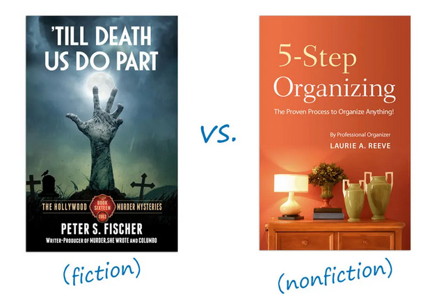
A fiction cover should appeal to the heart. What is the mood or feeling of your book? If you can pinpoint this, with a little searching, you will certainly be able to find an image that conveys that feeling. You may have better luck searching for concepts rather than things. So searching for “alone” or “lonely house” may provide you a better image than “lost cabin in the woods.”
Common photographic themes that can provide mood:
- Dark Clouds
- Shadows
- Light Rays
- Facial Expressions
A nonfiction cover should appeal to the mind. A metaphor will get the buyer thinking about what the book may be about. When choosing images, download a copy or sample of any image that you are considering. Try each of your ideas on the cover design with the cover type to see which one is the best before you pay.
2. Keep It Simple
One of the most common mistakes made in book cover design is overcomplicating the cover imagery or being too literal with it. Choosing one image or a direct focal point in the cover image will help your cover be more understandable and more enticing to potential readers. Ask yourself: if you were to drive down the highway and see a billboard of your book’s cover, would you be able to understand and determine what it is at a glance?
3. Focus On Your Title
Your readers need to know what your book called, which means they need to see your title as soon as they see the cover. Making the title your focal point will help direct your readers’ eye and entice them. Part of making your title the focal point is choosing the right font and size.
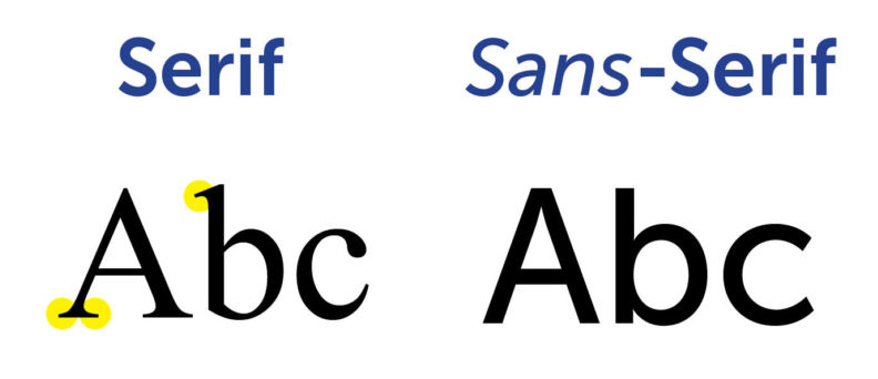
Choosing a serif vs. sans serif type face: Serifs are generally used more on literary or historical book covers. Sans serifs are used often on thrillers or on non-fiction. Here is comparison of the two types:
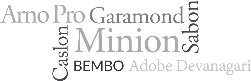
Choosing the right font: While it is tempting to choose a “fancy” face, resist this temptation. Many of these treatments absolutely guarantee an unprofessional cover design. Here are a few recommended typefaces:
Placing the type on your cover. It may seem a bit traditional, but you can’t go wrong with centered type! Keep your contrast as high as possible by using pure white type over a dark image, and pure black over a light image. When formatting your title, you may want to use wide letter spacing if your type is going over an image. If your background image is simple, you can choose a type with thinner letters. If the background image is busy, choose a heavier typeface.
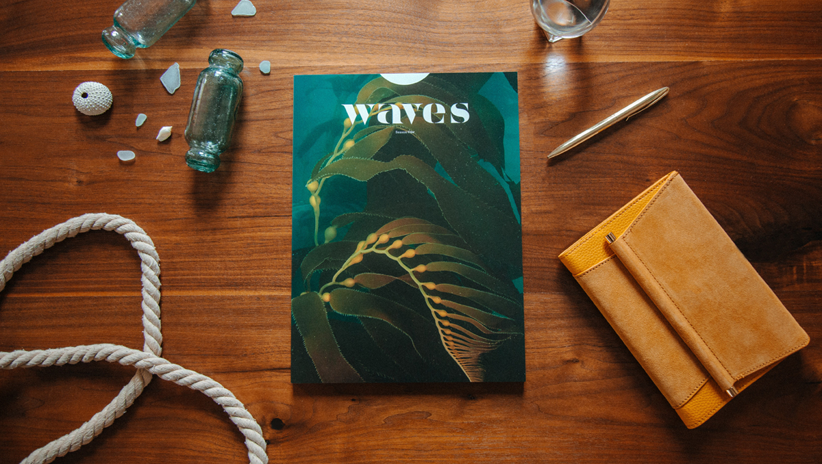
4. Rule of Thirds
This is a common guideline or best practice for photography but also relates to book covers. The rule of thirds is a composition style that recommends that you divide your artwork into three main sections, each taking up one-third of the cover. For example, your focal point (usually your title or center element) will take up one third of your cover, while the remaining two thirds would be left open for background elements. Your sections can be divided, vertically, or diagonally. Below is an example cover that utilizes the rule of thirds:

Following these four tips will help give your book a professional look and make it standout among the crowd. Designing a cover should be fun and most importantly it should be something you love.