If you have ever attempted to design your own book, you probably spent a lot of time perfecting your images. You would have wanted to make sure the words and colors look exactly how you imagined them in your head. However, when the book finally gets printed, this is often not the case.
A book will look different depending on how you view it. This means that your monitor, home printer, and even previous print runs may all look slightly different than your next print run. Due to the nature of printing, this is unavoidable. However, there are some steps you can take to reduce the differences. Your best option is to get a printed proof from your book printer prior to the books heading to production.
If you want to get ahead of the game or understand more about your book’s color, here is a brief overview how printers utilize colors, as well as strategies for how to best optimize your color.
What is Color?
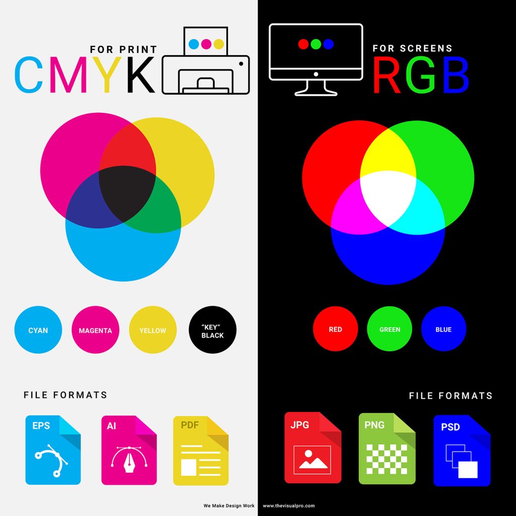
When viewed on a screen or monitor, color is composed of small beams of light, specifically red, green, and blue (RGB) light. These three colors combine to form almost any color imaginable. Since the color is backlit, it often appears bright and vibrant on your screen.
When you print, specifically digital book printing, the colors are made out of dry toner. Often this is a combination of Cyan, Magenta, Yellow, and Black (CMYK). Toner is a translucent dry powder that is heated up by the printer. An electric static shock is then sent through the toner, fusing the image onto the paper.
There are other types of printers out there, such as wide-format 12 color printers, or Inkjet that use wet ink for printing. However, for most high-quality books, dry CMYK toner is used.
Gorham Printing Digital Book Printers
Our printers are top-of-the-line Canon digital printers. We use dry, translucent toner, and our machines are G7 color calibrated throughout eacg day. The reason we are called a digital printer is because our digital presses use electrical static to transfer the image onto the paper. This is different from offset presses that utilize metal plates and ink to roll the images onto the pages. Our G7 Color is not only consistent but very accurate to your files. It produces the best printed color available.
What is Affecting Your Color
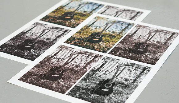
Say you have a old photograph or an image you found online that you want to use in your book. If you try to make the colors “match,” it might feel like aiming at a moving target. This could be caused by several reasons such as:
- The software you used to create the file
- How images were obtained (cameras or scanner)
- Your computer monitor’s quality, calibration and consistency
- The paper used for printing vs the original photo paper that may have been used
- The color mode of the file (RGB or CMYK)
- How your eyes view color
- Your personal color preferences
- Lighting conditions
When this happens, a printed proof becomes your secret weapon. Before receiving a printed proof, check your computer’s color settings so that you have a baseline. Additionally, make sure that your proof is being printed on the same paper stock that you plan on using for your final book.
After the printed proof arrives, make adjustments as needed to obtain an output you like. Keep in mind that matching your printed image to the original is almost impossible unless you are using all the same conditions. This is important to remember so you do not drive yourself mad with trying to match to an original.
Best Practices for Setting up Color in Files
The best way to review your color is to always get a printed proof from your printer. Once you have the printed proof, you can make color adjustments in your file to reach your desired output. Here are a few recommendations that can help get you as close as possible to your desired color:
- Solid color areas should be CMYK. Make sure that the color settings of your editing software is set to CMYK, not RGB. This is known as a “build” of CMYK. Solid areas color created using RGB can result in an unwanted color shift. For example, a solid red should be made with 0%C 100%M 100%Y and 0%K.
- Type should be 100% black (K only: no C, M, or Y). Sometimes color can look black but is actually varying shades of dark gray. Gray color uses a mix of several colors, whereas true black uses 100% black toner.
- White type should be 100% white (0% CMYK).
- Keep your type vector whenever possible, not screened.
Prior to printing, your images will go through an image processor that will translate any RGB images to CMYK for printing. RGB tends to look richer/darker on screen than the final CYMK image. Having your color setting set to CMYK will give you a closer accuracy from screen to printing. For this reason, we do not recommend having profiles assigned to your images.
*Can I send a custom color profile attached to my file? Our printers are set up for G7 Color and are calibrated everyday and throughout the day to keep accurate color. Applying a color profile could overwrite the machine’s color calibration and might cause severe color drifts and inaccuracy in color.
Best Software Settings for Print Color
Adobe CC (recommend setting up color in Adobe Bridge):
- In your color settings, we recommend selecting Adobe RGB, Coated GraCOL 2006, and Relative Colorimetric for a rendering intent. These are the same settings used by Gorham Printing designers.
- When Exporting your files as PDFs from InDesign, on the “Export Adobe PDF” settings screen, choose PDF/X-4:2008. This will prevent changes in your color.
*Does Gorham Printing offer ICC profiles? We do not provide ICC profiles because there are too many uncontrolled variables with your workstation, software, and files to result in a color “match.” For best results, we recommend using Adobe Creative Cloud to create your files using the settings outlined above.

Microsoft Word (or similar word processor):
- Most word processors only have RGB color options. However, if you prepare your images outside your word processor, make sure that you do so in CYMK. Your images may stay in CYMK when you import them into your word processor, but it will depend on your specific software.
- Since your screen will be illuminated, your images may appear darker when printed than they do on the screen. We recommend decreasing your lighting to about 5%-10%.
- When Exporting or Saving As a PDF from Word, choose the option for PDF/X-4:2008. If you do not have this option, select the most updated PDF option available.
What You Should NOT Do
- Do not use Pantone Spot Colors. The file will not print correctly but will be converted to a standard CMYK G7 color. We do not use spot colors in our printing process; they are only used in offset printing.
- Avoid considering your monitor as the target ideal color. Computer monitors use RGB colors illuminated by a light to display your file. This is fundamentally different from the viewing conditions of a printed file, where the CMYK color mode is used, and there is no light illumination. Also, your monitor is capable of showing more colors than a printer can print. You can simulate the brightness reduction of a printed piece by reducing the brightness of your monitor by 30%. However, this will only provide an approximate view and may still not be accurate.
- Do not print out your book on your personal printer. Your printer and your paper will not print like the digital book printers, even if you had the same color profiles. Home printers often print much darker than professional-grade printers and vary wildly in quality.
- Do not assume every printer output looks the same. If you printed your book at one book printer and then print the same book with a new printer later on, the output may look different. Everything from paper quality to the types of printers will be different. You can use the previous printing as a comparison, but most likely you will have to adjust your color after reviewing a printed proof.
- Do not be discouraged if you do not like the proof colors. It happens sometimes where the file just doesn’t print like you expected it to. This is okay. All you have to do is adjust your file’s colors. Instead of using your onscreen image, look at the proof and make adjustments accordingly. If you need some tips or recommendations, just give Gorham Printing a call.
Always Review a Printed Proof
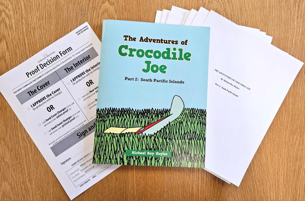
The only real way to check your color is to see it printed on the exact paper by the exact machines you plan to using for your full print run. This is why we offer Printed Proofs ($45) with an order so you can see exactly how it will look before approving your book for production. Printed proofs are neither bound nor laminated but will be an exact replica of your text and images.
After reviewing your proof, if you wish to make changes, you can submit new files and review additional proofs (see Service Rates for pricing), repeating the process as needed before going to production.
*Why can I not get a printed proof without placing an order? Since we are a short-run book printer and not a POD (print-on-demand) printer, or machines require intricate calibration prior to operation. Because of this setup requirement, the cost of printing one book is often equal to the cost of printing 25 or more books. Some of this setup, such as page count and trim size calibration, happens during the proof stage, allowing us to offer cost-effective proofs when paired with a full order.
To make changes to your proof, open up your original file (InDesign, Word, PS), go to the image you want to change, adjust the colors as you see fit, and export a new PDF.
The most common color adjustments are:
- Too Dark – Adjust the brightness by 5%-15%. If you are editing in Photoshop, use your levels and adjust the mid to dark range.
- Too Red – This means your image is magenta (the M in CYMK) heavy. If you are using Word, you can edit your image using separate photo editing software and then replace it in Word. Alternatively, you can use the Picture Format tools provided by Word under Color. If you are in InDesign, we recommend adjusting the color balances in Photoshop and relinking the images.
- Too Yellow – This means your image is yellow (Y) heavy. Use the steps in the “Too Red” bullet point to adjust your images.
- People are Too Pale – This means your image is either too bright or Cyan (C) heavy. Use the steps in the “Too Red” bullet point to adjust your images.
- People are Too Dark – Adjust the brightness by 5%-15%. If you are editing in Photoshop, use your levels and adjust the mid to dark range. You may also want to check your color mode because if your image is set RGB or sRGB especially this may be trying to make colors that are too rich which in turn is making them look dark. Switch to CMYK or just brighten midtones and dark ranges more.
- Images Look Dull – Adjusting your contrast and saturation may help with this. Your backlit screen may be making your images appear more saturated than they really are. Higher saturation will result in more toner is going on the page when printing.
Final Touch On Color
When it comes down to it, color is subjective and can be based on your personal preferences. When printing a book (or anything), make sure to get a printed proof on the exact paper stock from the same printer that will be printing the final run. Your proof will show you the real color of your file and how it will look. From there you can make adjustments to the file as needed. Never be afraid to ask questions! Call us or email us anytime.