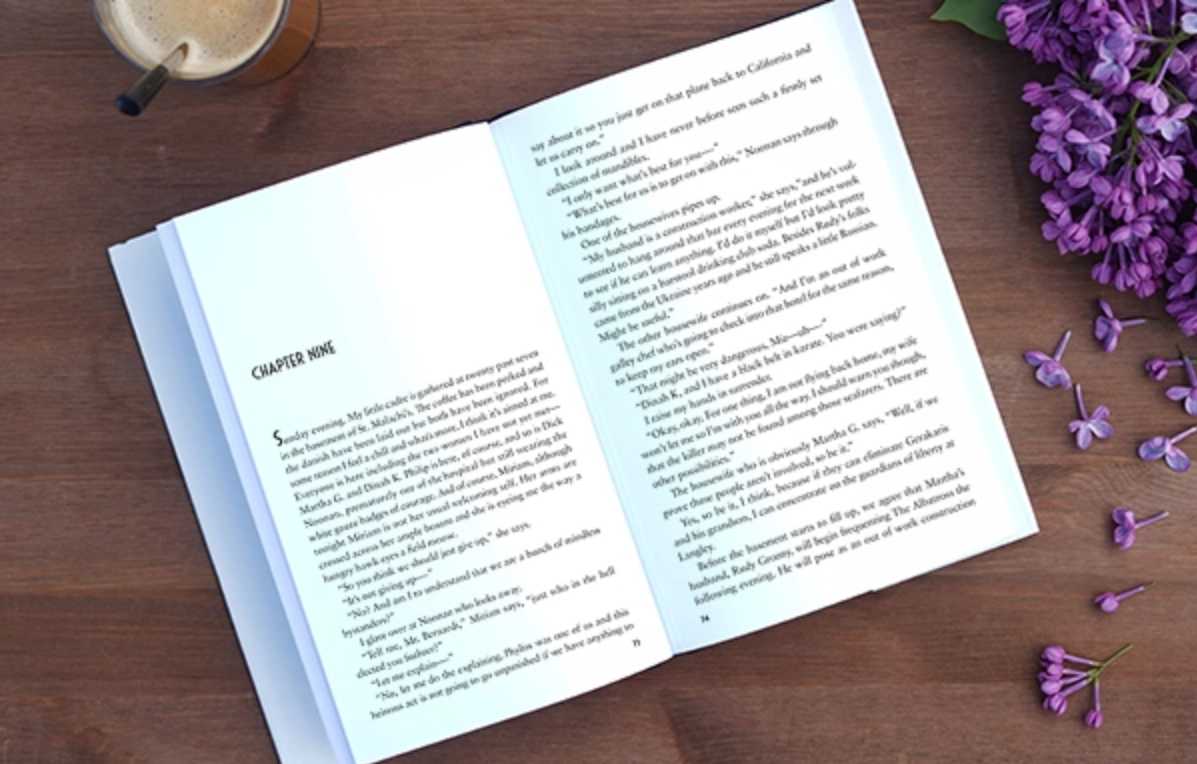
Books are full of so many different kinds of information, that it would be impossible to condense every type of element found in every type of book into one article. Below are the most common elements used in book page design. Keep in mind that not every book needs all of these elements. Most novels have nothing more than text and a page number!
Running Headers or Footers
Running headers appear at the tops (and sometimes the bottoms) of pages and are useful in helping the reader know their place in the book. A basic header consists of the author’s name on the verso (left-hand page) and the book title on the recto (right-hand page). Depending on your book, it may be better to utilize running headers by putting the chapter name, part name, or another important element on the headers instead.
Page numbers
Pretty much every book has page numbers. They are most commonly placed centered at the bottom of the page, or toward the outside margin at the top or bottom of the page. There are no particular rules on the placement of page numbers as long as they are consistent and easy for the reader to find.
Footnotes
Footnotes appear at the bottom of the page in a smaller font than the main body of the text. They can be separated from the text by a thin line or simply by a space. For particularly lengthy footnotes, they can run onto the next page. For books with few footnotes, an asterisk is usually sufficient to indicate the footnote. In books with excessive footnotes, numbers are more commonly used.
Pull quotes
A pull quote is a quote taken directly from the text and enlarged or set off by a different typeface or color on the page in order to entice the reader. They are commonly used in magazines but can also be effective in books.
Sidebars
Sidebars, like pull quotes, are offset from the main text and highlighted in some way. Rather than a direct quote from the text, they contain information related to the content on the page, such as a relevant quote, a short list, or a pertinent fact.
When deciding what elements to use in your page design, keep your audience in mind. Also consider the size of the book. Sidebars might not work so well in a 5.5” x 8.5” size book, but would work great in an 8” x 10” to help break up the page and keep the reader engaged. Think about how your reader will be using the book and make your design decisions accordingly. If you’re unsure, your book designer should be able to give you guidance.


