 When reading a book, the body style typeface or font is generally not something you notice right away. However, it has quite a bit to do with the readability of your book. You don’t want to curl up with a suspense novel and find you have a headache two chapters in from eye strain. No matter how thrilling the storyline, if the font style and leading is hard to read, you’re going to lose your audience. Our graphic designers here at Gorham Printing have years of experience in book design.
Take a book off your shelf (let’s stay with fiction) and open to any page. The body text is generally a serif font, meaning there are tiny feet at the bottom of most letters to help guide your eyes across the line of words. There are dozens of readable fonts such as Garamond, Minion, or Arno Pro used for text layout.
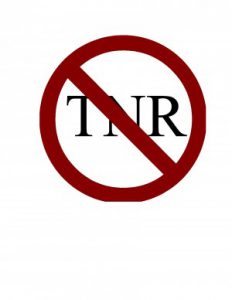
What you won’t find in any book industry standard layout is Times New Roman. What seems most difficult for self-publishing authors to realize is just because TNR is the default font for your word processing software does not mean it should be used for your book. Times New Roman was created for newspaper print, its narrow for typesetting in small columns.
The leading or spacing between the lines of text also helps with the ease of readability. The term leading is derived from the days of hot metal type when strips of lead were placed between lines of type to provide line spacing. Your text should not be single spaced nor double-spaced but somewhere in between. One rule of thumb is to make the leading 20% larger than the font size. So if you used a 12 pt font, your line spacing or leading should be around 14.4 pt.
Sans serif or decorative fonts can be used for chapter titles. However, when it comes to text layout, more is not better. Keep your styles down to two or three fonts only. Too many fonts and your book is going to look frenetic or too busy. Let’s say you used Garamond for the text body. You could use a smaller Garamond in small caps for the page headers and then a sans serif or decorative font for the chapter names. Or use a sans serif font for both the page headers and the chapter names.
Make your book look professional, as if it came from one of the big houses in New York. You’ve worked hard to finish the story, be sure it’s dressed out properly for your audience.


(Please, excuse me for my poor English) I am looking for “TextTemplate.pdf” in your pages, and I can not find it. Can you helpe me?
We do not have a template you can download, just instructions. Here is the page:
http://www.gorhamprinting.com/diy-book-printing/diy-text-instructions.html