Menu
The best color settings will vary from printer to printer. For optimal results, ensure that your editing software is using CMYK color. Black text should be 100% black (not grayscale) and should be vectorized, not rasterized. Computer monitors may be backlit, giving a false impression of your true print color. When reviewing files, reduce your monitor's brightness by around 30% to achieve a more accurate representation.
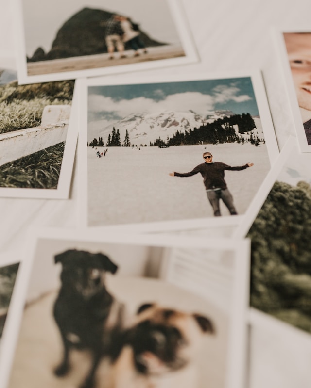
If you have ever attempted to design your own book, you probably spent a lot of time perfecting your images. You would have wanted to make sure the words and colors look exactly how you imagined them in your head. However, when the book finally gets printed, this is often not the case.
A book will look different depending on how you view it. This means that your monitor, home printer, and even previous print runs may all look slightly different than your next print run. Due to the nature of printing, this is unavoidable. However, there are some steps you can take to reduce the differences. Your best option is to get a printed proof from your printer, review it, and make corrections to your files' colors as needed.
Our printers are top-of-the-line Canon digital printers. We use dry, translucent toner, and our machines are G7 color calibrated throughout each day. The reason we are called a digital printer is because our digital presses use electrical static to transfer the image onto the paper. This is different from offset presses that utilize metal plates and ink to roll the images onto the pages. Our G7 Color is not only consistent but very accurate to your files. It produces the best printed color available.
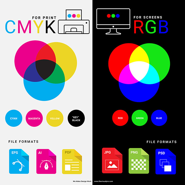
When viewed on a screen or monitor, color is composed of small beams of light, specifically red, green, and blue (RGB) light. These three colors combine to form almost any color imaginable. Since the color is backlit, it often appears bright and vibrant on your screen.
When you print, specifically digital book printing, the colors are made out of dry toner. Often this is a combination of Cyan, Magenta, Yellow, and Black (CMYK). Toner is a translucent dry powder that is heated up by the printer. An electric static shock is then sent through the toner, fusing the image onto the paper.
There are other types of printers out there, such as wide-format 12 color printers, or Inkjet that use wet ink for printing. However, for most high-quality books, dry CMYK toner is used.
Say you have a old photograph or an image you found online that you want to use in your book. If you try to make the colors "match," it might feel like aiming at a moving target. This could be caused by several reasons such as:
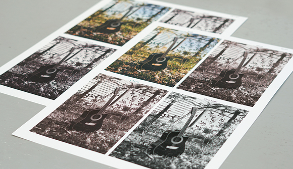
When this happens, a printed proof becomes your secret weapon. Before receiving a printed proof, check your computer’s color settings so that you have a baseline. Additionally, make sure that your proof is being printed on the same paper stock that you plan on using for your final book.
After the printed proof arrives, make adjustments as needed to obtain an output you like. Keep in mind that matching your printed image to the original is almost impossible unless you are using all the same conditions. This is important to remember so you do not drive yourself mad with trying to match to an original.
The best way to review your color is to always get a printed proof from your printer. Once you have the printed proof, you can make color adjustments in your file to reach your desired output. Here are a few recommendations that can help get you as close as possible to your desired color:
Prior to printing, your images will go through an image processor that will translate any RGB images to CMYK for printing. RGB tends to look richer/darker on screen than the final CYMK image. Having your color setting set to CMYK will give you a closer accuracy from screen to printing. For this reason, we do not recommend having profiles assigned to your images.
*Can I send a custom color profile attached to my file? Our printers are set up for G7 Color and are calibrated everyday and throughout the day to keep accurate color. Applying a color profile could overwrite the machine’s color calibration and might cause severe color drifts and inaccuracy in color.
*Does Gorham Printing offer ICC profiles? We do not provide ICC profiles because there are too many uncontrolled variables with your workstation, software, and files to result in a color “match.” For best results, we recommend using Adobe Creative Cloud to create your files using the settings outlined above.


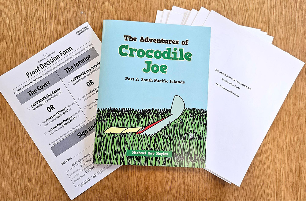
The only real way to check your color is to see it printed on the exact paper by the exact machines you plan to using for your full print run. This is why we offer Printed Proofs ($45) with an order so you can see exactly how it will look before approving your book for production. Printed proofs are neither bound nor laminated but will be an exact replica of your text and images.
After reviewing your proof, if you wish to make changes, you can submit new files and review additional proofs (see Service Rates for pricing), repeating the process as needed before going to production.
*Why can I not get a printed proof without placing an order? Since we are a short-run book printer and not a POD (print-on-demand) printer, or machines require intricate calibration prior to operation. Because of this setup requirement, the cost of printing one book is often equal to the cost of printing 25 or more books. Some of this setup, such as page count and trim size calibration, happens during the proof stage, allowing us to offer cost-effective proofs when paired with a full order.
To make changes to your proof, open up your original file (InDesign, Word, PS), go to the image you want to change, adjust the colors as you see fit, and export a new PDF.

When it comes down to it, color is subjective and can be based on your personal preferences. When printing a book (or anything), make sure to get a printed proof on the exact paper stock from the same printer that will be printing the final run. Your proof will show you the real color of your file and how it will look. From there you can make adjustments to the file as needed. Never be afraid to ask questions!
Have questions? Call us to talk with a team member from our Washington office. You’ll always talk to a real person, and we answer in seconds. Plus, you’ll have a dedicated rep working with you through every stage of your print order.
Get marketing tips, design inspiration and more from the world of DIY book printing.
© 2026 Gorham Printing Inc. All rights reserved. Privacy Statement