Menu
How does a great cover concept happen? Factors such as visual appeal, the book’s audience, color, and font usage are just some of the aspects to be considered. In addition to conceptualizing your cover, a designer must have the technical skills to put those ideas into print.
Photographs are the image type of choice for book covers these days. Quality custom illustration or expensive photo shoots are often above the budget for authors who are financing their own book and want to turn a profit. Illustrations from a non-professional will result in a homemade look.
Stock images are a great resource for self-published authors. These images can be of very high quality for a very low price. You will want to look for royalty-free images with 300dpi.
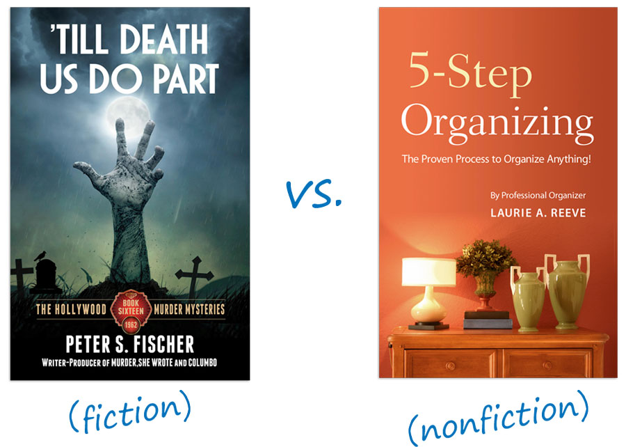
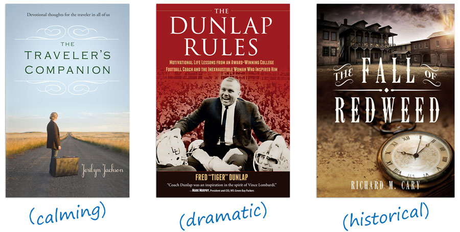
A fiction cover should appeal to the heart. What is the mood or feeling of your book? If you can pinpoint this, with a little searching, you will certainly be able to find an image that conveys that feeling. You may have better luck searching for concepts rather than things. So searching for “alone” or “lonely house” may provide you a better image than “lost cabin in the woods”. Common photographic themes that can provide mood:
A non-fiction cover should appeal to the mind with a concept. A metaphor will get the buyer thinking about what the book may be about. When choosing images, download a copy of any image that you are considering and try each of your ideas on the cover design with the type to see which one is the best before you pay.
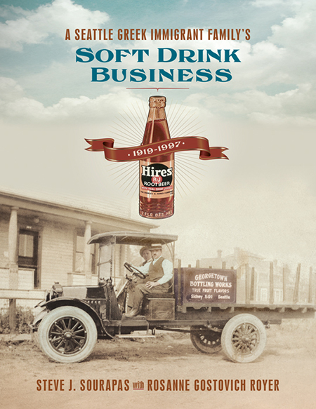
Historical images can give books a sense of permanence and importance.
Paintings. Simply using an old master painting can give your book an immediate feeling of quality. Sources for historical paintings include:
Old photos. Vintage photographs can be used in many ways. Some are humorously quaint or even funny. Sources for old photos include:
Illustrations or Engravings. Victorian engravings or botanicals can also make an intriguing cover. Most stock image sites have them.
There are many schools of thought out there about book cover colors. Dozens of articles have been published on how some colors influence buyers. Choosing color is an art not a science, so there is no right answer:
Often authors think the image on the front cover should be a literal interpretation of the title. It’s often better to use an image that is unexpected or the opposite of your title. A sense of mystery makes the buyer curious and interested.
While it is tempting to choose a “fancy” face , resist this temptation. Many of these treatments absolutely guarantee an unprofessional cover design. You can’t go wrong with clean, simple readable type.
Common cover elements include:
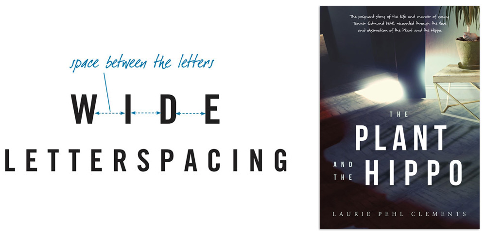
Letterspacing. When formatting your title, you may want to use wide letterspacing if your type is going over an image. If your background image is fairly simple, you can choose a type with thinner letters. If the background image is busy, choose a heavier typeface.
You may think it is boring, but you can’t go wrong with centered type! Keep your contrast as high as possible by using pure white type over a dark image, and pure black over a light image.
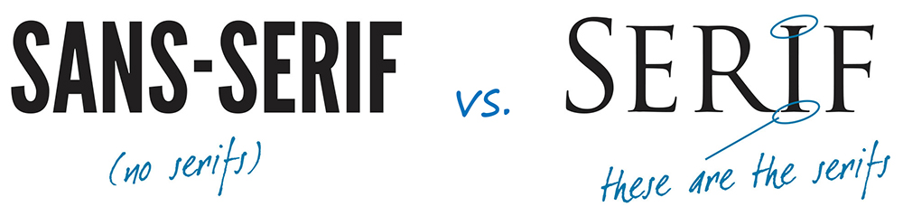
Serif vs. Sans-serif. Serifs are generally used more on literary or historical book covers. Sans serifs are used often on thrillers or on non-fiction.
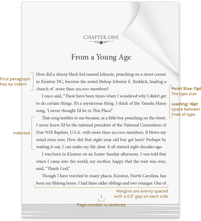
People are often surprised to learn that the text pages of a book are "designed." For every book that attracts you in the bookstore, someone took time and effort to make the text design as beautiful and readable as possible.
Traditonally, typefaces for books have serifs on their letterforms. Serifs are the strokes that project from the top or bottom of the main stroke of the letter. They assist readability by keeping the reader’s eye flowing horizontally across the words. Typefaces without serifs (sans serif) are fine for headings but don’t work well for large sections of body copy.
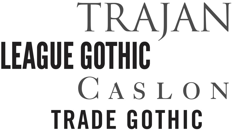
The tone or feeling of the typeface is very important. Typefaces will exude a mood that can enhance your writing when used effectively. Font Size for most industry standard books are between 10pt and 12.5pt fonts. With the leading being no more than 1.5x the font size. Check copies of books you enjoy reading, and you will probably be surprised by the type size. A few of our favorite typefaces are below:

The grammar and stylistic choices used by professional book designers may seem like an entirely different language at times. However, these designers are actually following finely curated ruleset, intended to maximize readability and flow. These simple design tips will help you navigate the subtle design choices that separate amateur design from professional.
Get marketing tips, design inspiration and more from the world of DIY book printing.
© 2026 Gorham Printing Inc. All rights reserved. Privacy Statement